
Color Wheel is a fundamental element in visual design, painting, photography, and filmmaking. The art of creating balanced, harmonious, and aesthetically pleasing compositions would require a solid understanding of the principles of the color wheel. Whether it’s for a designer, an artist, or just an average Joe curious about color theory, knowing how to use the color wheel could elevate one’s creativity in decision-making.
A color wheel is a visual representation of colors organized in a circular format. It explains the relationship and composition of different colors. Exploring its structure, types of colors, and practical applications could generate confidence in using colors dynamically.
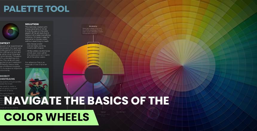
What is a Color Wheel?
A circular diagram that displays the primary, secondary, and tertiary colors in a very organized manner is known as a color wheel. It is basically a guide to understanding color relationships, how colors mix, and how they interact with each other in different compositions. The modern-day color wheel that is common in the art world and design is the RYB (Red, Yellow, Blue); while that of computers-the RGB (Red, Green, Blue) color wheel-is for digital screens and lighting.
The color wheel is divided into warm and cool colors. Warm colors, like red and orange or yellow, inspire energy, excitement, and warmth. On the other hand, cool colors, such as blue and green and purple, offer calm, relaxation, and serenity. These divisions set the right palette selection for different moods or occasions and applications.
Primary, Secondary, and Tertiary Colors
1. Basic Colors
Such primary hues are the base of the color wheel. They are:
Red
Yellow
Blue
They cannot create all other colors in combination with other colors. They are the base for forming all the rest.
2. Secondary Colors
They happen to be combinations of two primary colors:
Red + Yellow = Orange
Yellow + Blue = Green
Blue + Red = Purple
Secondary colors are best at enriching the color range so that they allow for more choice in design and art.
3. Tertiary Colors
When one primary color and one secondary color are mixed, we obtain tertiary colors. Examples are as follows:
Red-Orange
Yellow-Orange
Yellow-Green
Blue-Green
Blue-Purple
Red-Purple
These colors provide more depth and layers of interest for palettes, allowing for more subtle and richer palettes.
Color Harmony: How Colors Work Together
The color wheel serves to generate harmony of colors-all of which combines together healthily, in enhancement rather than clash. There are many ways to achieve this harmony, usually depending upon the totally different points in the color wheel.
1. Complementary Colors
This means colors, which are opposite to each other on the wheel. They build amazing contrast as well as huge visual interest. Between them can be mentioned for instance:
Red and Green
Blue and Orange
Yellow and Purple
This is usually used for those better with the screaming and dynamic images. Complementing colors, however, must be well balanced as to not overly impress on the viewer.
2. Analogous Colors
These colors are next to each other in the wheel. They integrate each other, thus bringing a more harmonious, yet natural appearance. Blue, Blue-Green and Green
Yellow, Yellow-Orange, and Orange
Also much similar to what can be found in nature, making it perfect for soft, coherent, and peaceful designs.
3. Triadic Colors
Triadic schemes are composed of three colors, evenly spaced on the color wheel to shape a triangle. Examples include:
Red, Yellow, and Blue
Purple, Green, and Orange
It creates dynamic and balanced effects making it very apt for eye-catching designs.
4. Split-complementary
The basic color with two colors adjacent to its opposite may be called one kind of complementary color. For example:
Red, Yellow-Green, and Blue-Green
Blue, Orange-Red, and Yellow-Orange
This scheme provides less contrast compared to pure complementary and maintains a contrast effect as well.
5. Monochromatic
Monochromatic refers to shades, tones, and tints of a single color. For instance, use blue alone but with different brightness and saturation, thus making a cohesive, sleek look.
6. Tetradic Colors (Double Complementary)
This scheme uses two sets of complementary colors, forming a rectangle on the wheel. For example: Red and Green or Blue and Orange. It offers a broad demonstration of colors, but they must be used well to avoid clashing.
Warm: Cool Colors/ Psych Effects- Warmish and Cool. This division has a perspective impact on the emotions and how it is seen.
Warm Colors (Red, Orange, Yellow)- These colors signify love, vigor, excitement, and warmth. Most likely, these are effective applications used in branding, restaurants, and entertainment. Cool Colors (Blue, Green, Purple): These generate calm, stability, professionalism, and relaxation. Normally, one would find these in corporate branding, health care, and wellness industries.
Hence, a study using warm against cool could really help in influencing one’s emotions and engagement.
How to Use the Color Wheel in Design and Art
The Application of Color Theory:
1. Graphic Design & Branding- Companies create very strong brands with the application of color theory. For example:
Red- Coca-Cola, YouTube; represents excitement and energy.
Blue- Facebook, LinkedIn, Twitter; creates a sense of trust and professionalism.
2. Interior Design
The color wheel helps choose the right colors for walls, furniture, and furnishing accessories to create harmony in which one is living.
3. Film & Photography
Color grading is part of cinematography using the color wheel, creating moods for a scene. It uses complementary colors to provide high contrast and uses analogous colors to bring about harmony naturally.
4. Fashion & Styling
Fashion designers create visually good combinations of clothes by matching analogous or complementary colors using the color wheel.
5. Painting & Fine Arts
The color wheel is used to create depth, contrast, and harmony in the artist’s compositions. Knowledge of relationships and laws about colors allows more freedom in expression so results in balanced, harmonious work.
Conclusion
The color wheel is a one-click-open resource of everybody professional in the field of color. All designers, artists, photographers or filmmakers come to understand color relations, harmonies, or contrasts to compose a picture much more likable and emotionally assembling.
With primary, secondary, or tertiary colors; understanding color harmony techniques; and manipulating warm versus cool color psyches, you’ll be better able to make decisions about the task. The color wheel will yield creative wisdom into any effort, be it logo design, painting a masterly work, or picking an outfit.

Take a look at how IFDA helps you to have a great career by delivering the best content and practice.